Amazon’s stock has tumbled enough over the past week to do real damage to its long-term chart — and enough to warn investors the worst may be yet to come.
But amid the market turmoil and concerns over how inflation and fast-rising interest rates might hurt the e-commerce giant’s customer base in the coming months, there are also a some technical tells that suggest the stock may be getting pretty close to an inflection point.
First, the bad news. Amazon.com Inc.
AMZN,
stock has taken a historic beating since the middle of last week. And for the fifth straight session, the stock erased an early intraday gain of at least 1% to sink into the red.
On Friday, it was up as much as 3.5% mid-morning before pulling a sharp U-turn to trade down 0.3% in afternoon trading, heading toward the longest losing streak in three years. It has plunged 26.1% during the streak, which would be the worst performance over any eight-day period since the period that ended Nov. 14, 2008.
The sharp price weakness comes at time of negative fundamental developments as well, as the company last week reported disappointing third-quarter revenue and a downbeat outlook for the holiday period and said it was pausing hiring for corporate jobs while it monitors the outlook for the economy.
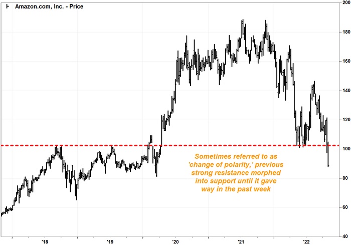
John Kosar, chief market strategist at Asbury Research, said that the stock has broken below a key support level at $102.53 on the long-term weekly charts.
An old Wall Street adage says that previous resistance, once broken, often turns into support. The stronger the resistance on the way up, the stronger the support on the way down.
The thinking is that when investors sell stock at a certain price and the stock subsequently rises above that price and then falls back to it, it becomes more likely that those same sellers will buy that stock back.
For Amazon, the support Kosar refers to comes from the five-year weekly bar chart, with each bar depicting the week’s open, close and trading range.

FactSet, MarketWatch
The $102.53 level marked resistance at the high for the week ending Sept. 7, 2018, which was backed up a month later when the stock peaked at $101.66 before plummeting about 36% to the Dec. 28 weekly low of $65.35. The resistance beat back another rally, as the stock topped out at $101.79 in July 2019.
Resistance finally gave way in February 2020 and, following an initial pullback period, sparked a rally that took the stock up to its record close in July 2021.
After the postpandemic rally faded, previous resistance passed two hard tests of support in May and June of 2022, which led to a big bounce into August.
But the latest selloff proved too much for support to handle.
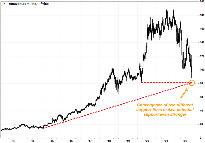
With key support broken, “it clears the way for a move down to $81.30,” Kosar said.
That’s the low for the week ending March 20, 2020, at the height of COVID-19 pandemic uncertainty and fears, and also the low of the pullback prior to the postpandemic surge.

FactSet, MarketWatch
Now for the good news.
Adding to the importance of that support, a rising trendline that starts at the January 2015 weekly low and connects with the January 2016 low extends to just above $81.
The convergence of two different types of support likely makes that level an even stronger support area than if they were separate.
A third chart point may be the charm. The key 61.8% Fibonacci retracement of the uptrend rising off the January 2016 weekly low to the July 2021 all-time weekly high comes in at roughly the same level.

FactSet, MarketWatch
That retracement level is based on the mathematical Fibonacci ratio of 1.618, which is also known as the golden ratio given its prevalence in natural systems. Many Fibonacci followers on Wall Street believe that the 61.8% retracement can act as an important chart level, because if it breaks, it suggests the prior trend is no longer intact. Read more about the significance of the Fibonacci ratio in chart analysis.
“Fibo” levels aren’t necessarily areas of natural support, but they can act as guideposts, which at a time of heightened uncertainty can provide comfort for investors. And the more chart points that come up at a similar level, the more visible they become to potential buyers — particularly, perhaps, when the charts are showing bullish technical divergence.
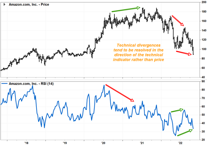
While Amazon’s stock price has been falling, making for lower highs and lower lows, the relative strength index (RSI) has been trending higher for the past several months, making for higher highs and higher lows.

FactSet, MarketWatch
The RSI is an underlying momentum indicator that attempts to depict how the magnitude of recent declines compares with recent gains. When an RSI is making a higher low while prices are falling, it suggests it’s taking more and more energy out of the bears to push prices lower, and the bulls are building up strength.
The bullish divergence seen in Amazon’s weekly chart would be classified as the strongest, or “Class A,” divergence, as defined by the CMT Association.
Technical divergences aren’t good timing tools, as they can last for long periods of time before they are finally resolved. But they do tend to resolve themselves in the direction of the technical indicator.
And they can act as a warning not to sell into a bounce, if and when one occurs.
